"I know you've heard it a thousand times before. But it's true--hard work pays off. If you want to be good, you have to practice, practice, practice. If you don't love something, then don't do it."
–Ray Bradbury
The saying 'practice makes perfect’ can apply to many disciplines –sports; music; art.
But it also applies to your work. Whether you are a master at spreadsheets, a whiz at making calls, or a commander of the conference room, the more you practice your role in the workplace the better you become. No matter your title.
I view every project we take on as an opportunity to hone my craft and to practice at it.
I’m proud of every piece of creative work I’ve produced because every piece of work is my best to date.
A unique dynamic of my job the ability to go back and see my past work. A quick search on Youtube and I can find our client’s past videos. Or I can search backup drives to find graphics and animations I’ve created.
Here are a few examples of transparent improvement in the work that I have done here at MEDIABOSS.
These past projects range from graphic lower thirds to full character animations.
Character Design:
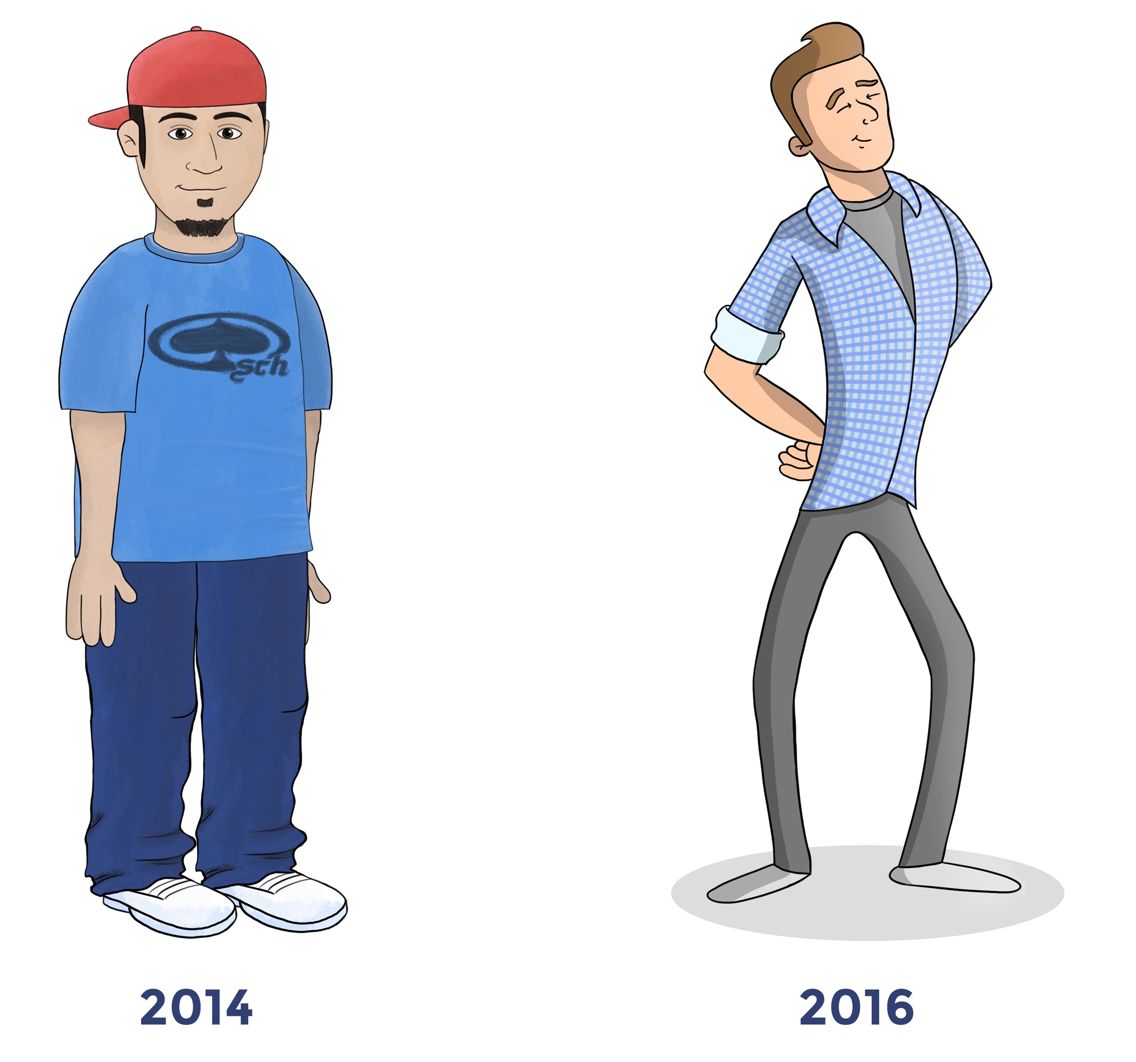
Learning to draw characters takes lots of practice. The more you draw, the better your characters will turn out.
The key to creating dynamic characters is to draw them in strong poses. But drawing strong poses is much more difficult and takes considerable practice.
As you can see, the character on the right has a much stronger pose than the character on the left.
Character Animation:
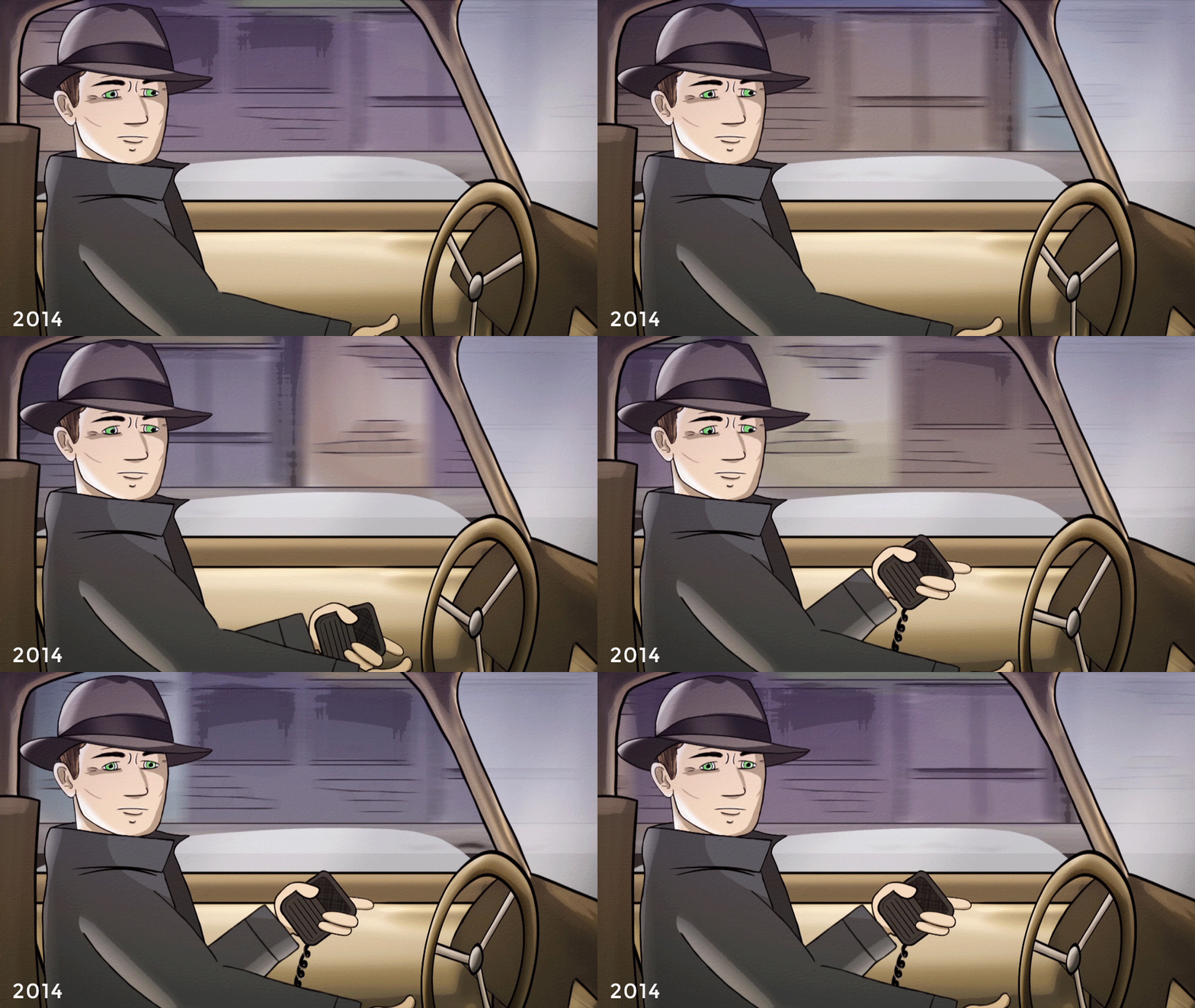
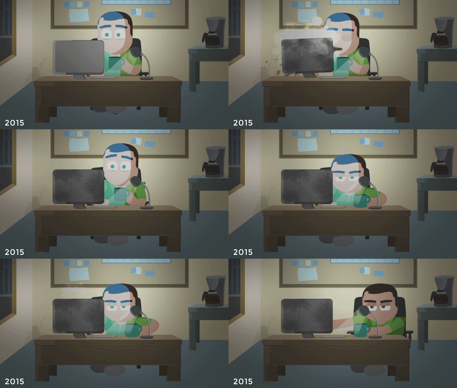
Animating characters takes time. Exactly how much time depends on the amount of detail you're able to put in - and the budget with which you have to work.
The clip from 2014 is a less detailed character animation. The budget was smaller and the client’s timeline meant that I needed to animate quickly and under a strict deadline.
The clip below from 2015 has much more going on. This character has complex facial animation, as well as body language and attitude. It took several hours to complete this shot.
Logo Animation:
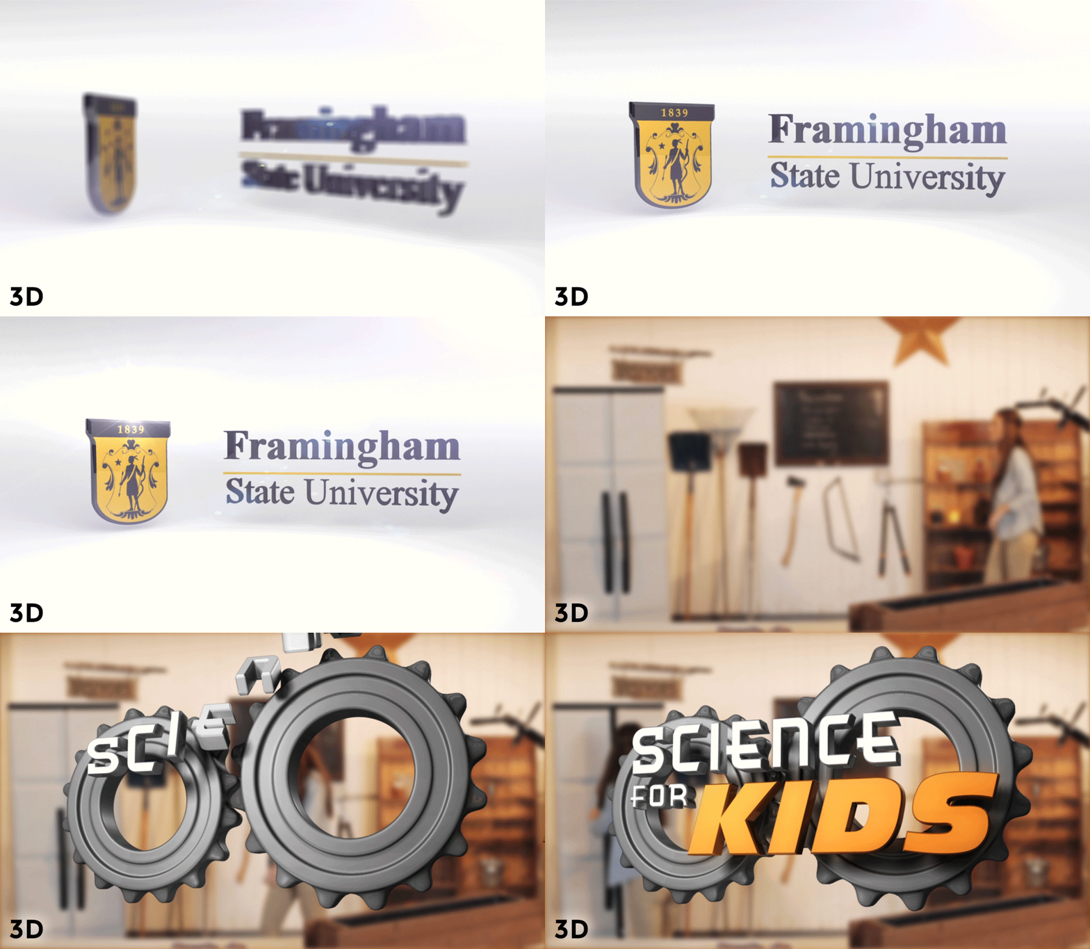
Logo animations can come in all forms. Whether it's a flat 2D style, or a complex and dynamic 3D design, each has their place, depending on time and budget.
3D designs are exponentially more complex and time consuming, but give a feeling of reality. 2D designs are simpler than 3D and can be completed in a tighter time frame, tools and expertise considered.
Above, you’ll see several examples of the 2D and 3D animations I’ve built over the years.
Lower Thirds:

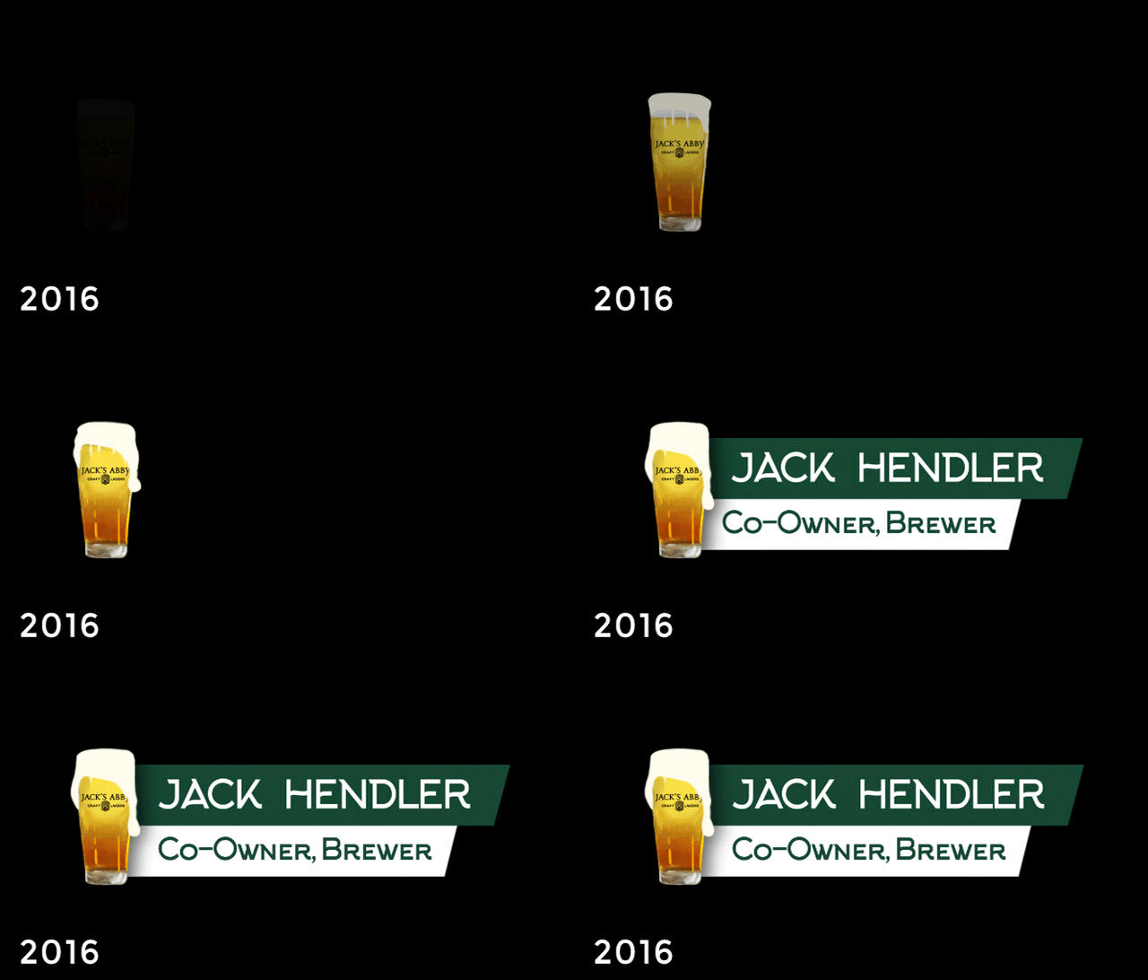
Title lower thirds are essential for letting your audience know who, in your video, is on screen. Many lower third designs are either boring, or bought from a graphics template package.
At MediaBoss, we like to go above an beyond with our lower third designs. We even go a step further and animate them, rather than just fading them up in Avid.
These two examples show my creative growth and skill level over the course of 3 years.
The improvement in the way they are designed and animated is very clear. In my opinion, the graphic elements in the first one look like they were made by a toddler (haha.)
The example from 2016 shows my ability to create frame by frame animation. It is also line with Jack's Abby's branding.
CONCLUSION:
It doesn't matter if you work in graphic design, animation or any other creative medium, the only way you will get better at your job is if you practice.
The most important piece of advice I can give to anyone looking to improve their skills is to love what you do. Because when you love what you do, practicing feels like play.


Comments